
Introducing the interactive dive chart
A few days ago I shared the first piece of the dive profile. Today I'm finally presenting the rest: the new dive profile section, built around an interactive dive chart that lets you replay your dive, event by event and condition by condition. It reads the samples your dive computer records at periodic intervals through the dive, tracking depth, temperature, CNS, ppO₂ and much more.
This is one of the features I'm most proud of. I've relied on dive charts for years to review my own dives, for all sorts of reasons: inspecting the profile of a deco dive, working out the best navigation for a site, or debugging my rebreather's ppO₂ and sensor readings. For all of those, and many more, the interactive dive chart is now there for you too.
The chart can plot a large set of channels, and you switch each one on or off from the controls along the top:
- Depth — the spine of the chart: how deep you were at every moment, drawn inverted with the surface at the top.
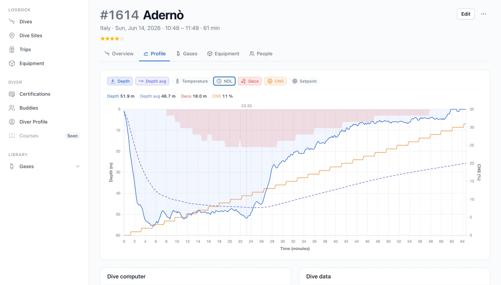
- Average depth — the running mean depth from the start of the dive, a quick read on how the time was spent.
- Temperature — the water temperature your computer logged through the dive.
- NDL — your no-decompression limit: how much no-stop time you had left at each point.
- Deco ceiling — on a deco dive, the shallowest depth you may ascend to, drawn as a band from the surface down to the ceiling.
- CNS — your central-nervous-system oxygen toxicity loading, as a percentage of the limit.
- Setpoint — for closed-circuit divers, the ppO₂ your rebreather is targeting.
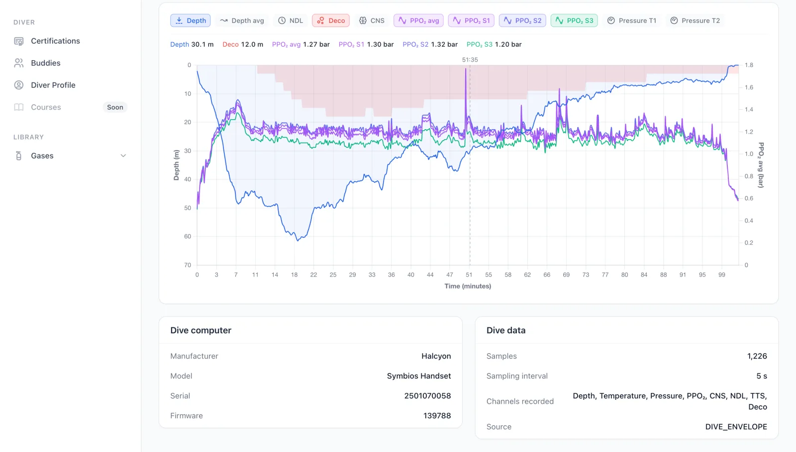
- ppO₂ — the partial pressure of oxygen you were breathing, averaged across the sensors (and split per cell; more on that below).
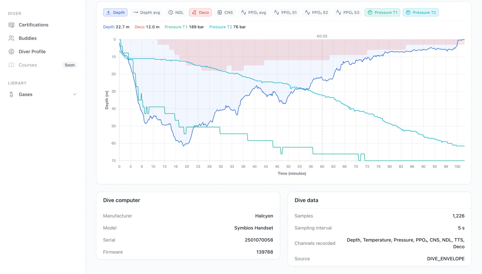
- Pressure — the gas pressure in your cylinder, one line per tank.
- Heart rate — for computers that record it, your heart rate through the dive.
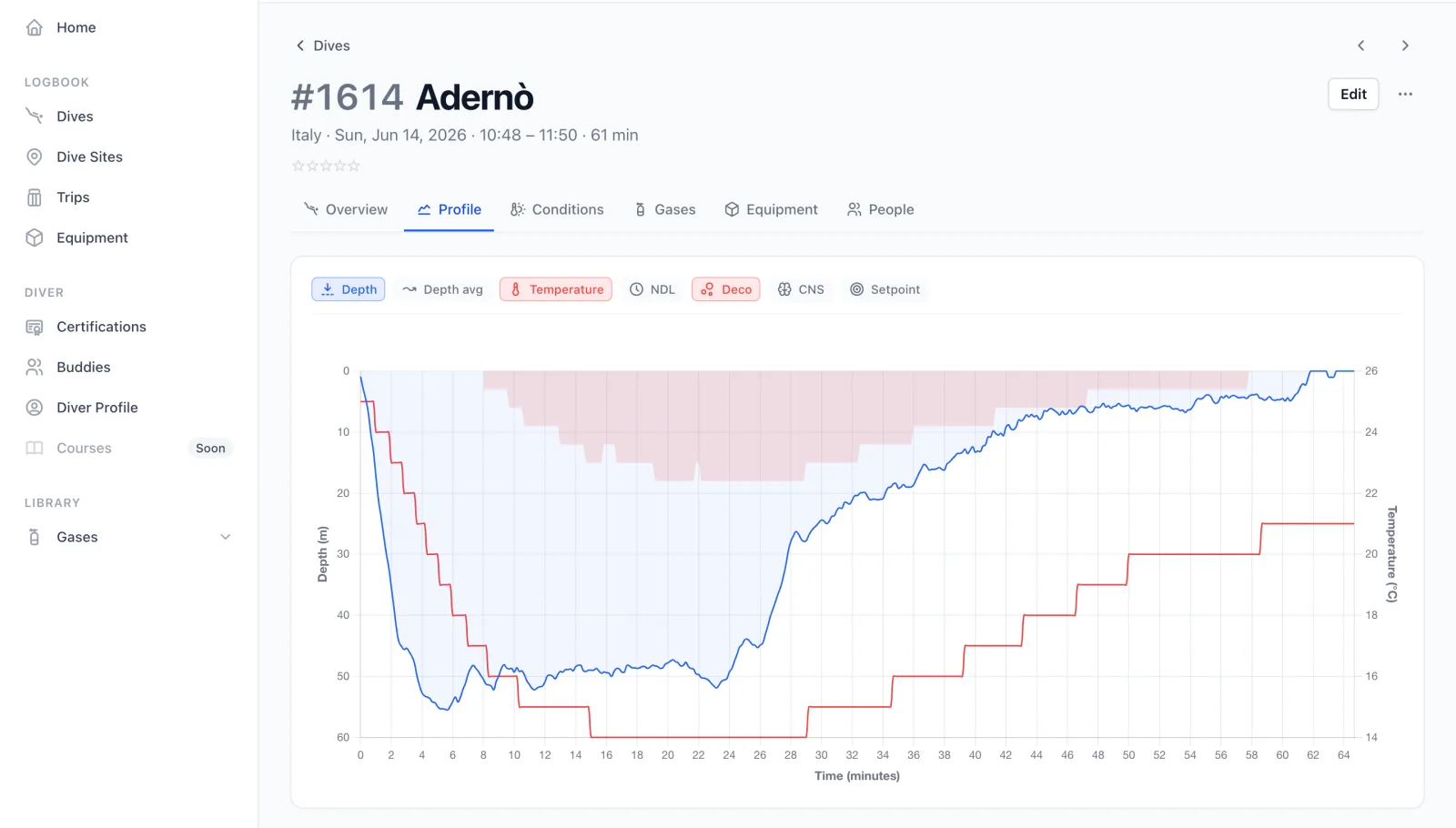
Move your cursor across the chart and a crosshair follows it, reporting every active channel's value at that exact moment in the dive.
It also has a few tricks aimed at rebreather divers and more advanced computers. For a rebreather that reports each oxygen cell individually, like the Halcyon Symbios chest-mount, the chart plots every cell alongside a calculated average, so you can watch the cells track each other and spot a lagging one at a glance.
Likewise, for computers with integrated gas pressure sensors, it breaks out consumption for each tank on its own line, so a multi-cylinder dive shows every cylinder draining independently.
Every chart starts with an import. The dive chart is built entirely on top of the samples your dive computer recorded, so it is only ever as rich as the data you bring in. Divebase reads those samples whenever you import a dive from UDDF or from a Garmin FIT file, and the more channels your computer logged, the more the chart has to show. Import a dive, and its profile is ready to explore.
You can probably tell I've spent a considerable amount of time shaping every detail here. It stands on a solid foundation: more than ten years of poring over dives in my MacDive archive, which shipped a remarkably advanced interactive chart back in its day. Last year I built DiveViewer, an online tool for visualising UDDF dives that carried my first fully redesigned interactive chart, and then DiveExporter, which brings that chart to iOS. The Divebase chart is the next step, and the best one yet.
I hope you'll love inspecting your dives as much as I've loved visualising mine. That's all for now: happy scrubbing, and dive safe! 🤿